Untitled Document
     
Advertisement Click to advertise with us!
     

Conn "Transitional" Horns on ONE Page!

pete

Brassica Oleracea
Staff member
Administrator
I just fooled around with this and I think it came out fairly nicely. Contents:

Both Gold and Silver:
* Split bell key altos w/Transitional engraving
* Single-side bell key altos w/Transitional engraving
* Single-side bell key altos w/"Naked Lady" engraving

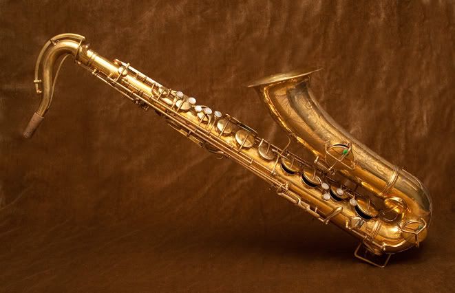
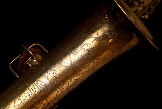
* Split bell key tenors w/Transitional engraving
* Split bell key tenors w/"Naked Lady" engraving

In Silver:
4m, 18m, 6m, 8m, 10m, 12m Transitional-engraved horns

All the pics are clickable and will take you to appropriate galleries.

=============

I plan to add some altos or tenors in all the available finishes, but I haven't been able to find good pics of a bare brass alto.
 
That's really nice Pete. When did you have to do all that? ;) BTW, maybe you should link anything going to my site to the new .info extension, rather than .ca. Keeps LP happier until we kick everything over. Speaking of which, I owe you an email...

Anyways, one thought I had, I don't know how you feel about this, but you might consider having the links to the off-site galleries open in a new browser window or tab. Otherwise people have to hit the back button to get back to your site.

I know some people consider it bad web design etiquette nowadays, but personally, I just find it easier to navigate back to a site (especially one that has more links I might one to explore), if I don't have to go hit the back button all the time. For less web saavy people, it's also just all around easier as well than all the short cuts like right clicking to open a new tab, or short cutting across a whole bunch of viewed pages.
 
Well, I'm not necessarily *finished* with it :)

A very long time ago, I got into the habit of right-clicking a link and choosing "open in new tab" or "open in new window," if I wanted to keep the page I'm launching from open. IMO, if I put the code in for "open in new window," I've taken away your choice of letting you close out the original page. Additionally, the page I have this linked off of, my Gallery, doesn't allow the "open in new tab/window": it just opens the link in the window you've got ... unless you right-click.

I'm very, very happy with the pics from intofoc.usmontreal and I kinda wish he had a full set of Conn Transitional horns. He's also recently had really nice pics of Holton Rudy Wiedoeft gold-plated alto on eBay, a couple weeks back. Even though I know that the Holton isn't a great horn, the pics make me want to possess the shiny. I've also got a couple other of his horns archived somewhere.

Oh. I should e-mail you about your 'site, too. I found some good info ....
 
I thought that Holton looked familiar. Same horn. Same rebuild. Same serial number. Almost the same selling price. Almost a year apart in sales though. I wonder why it came back to him?

I hear what you're saying about the right click BTW. I do the same thing when I'm on others' sites. I just work with lots and lots of people who know jack about right clicking. That's why I make it as easy as possible with the new window thingy when I set up my links. And since my browsers all support tabs, I hardly ever get a new window--unless I purposely open one that is.
 
Great pics indeed and the first row I saw which leads you step by step from the NW2 to the 6M.
And a happy and swinging New Year to you and the Forum.
J
 
Absolutely beautiful. I finally found the link cleverly disguised as the first sentence in your post. Would it be possible to highlight links with a different color so slow folks like myself can find them sooner.
 
Absolutely beautiful. I finally found the link cleverly disguised as the first sentence in your post. Would it be possible to highlight links with a different color so slow folks like myself can find them sooner.
Well, if you use the forum default theme, the link's in red. Normal text is black.

I've been asked by Jim about the same thing. The answer is that I could do that -- highlight or underline or whatever -- but I can't do it on a per-person basis. I can only do it per theme. That then means that people that like the theme the way it was might complain. However, if you want to, g'head and poll it at http://www.woodwindforum.com/forum/index.php?forums/new-forum-stuff.1210/. If I get, say, 10-15 folks that want me to modify the default theme, I'll do it. You can also check out http://www.woodwindforum.com/forum/index.php?threads/the-new-forum-software.25140/#post-239146. If you can find a free theme you'd like that does what you want, I can get that for you: installing themes = easy. Modifying themes = harder.
 
Ok de fault was mine. Dang, I was just becoming fond of the mean green layout. Back to the red and grey. Oh well. Life's hard.
 
Naaahh. Not a fault, JBT. I was quite fond of "Mean Green" myself, which was why I modified two versions of it here. However, I really do like the Grey Folio Red default theme. Took me a little while, but it grew on me.

One of the reasons why I've liked the "intofoc.usmontreal" pics is because he poses his horns almost exactly the same. USAHorn.com does that too, and I really appreciate it: you can do that 1-to-1 comparison. intofoc.usmontreal just takes higher quality pics. (He's also had a couple horns on an artists' website. I'll see if I can find the link.)

Anyhow, I still want to do a page like this for all the finishes that were available for the NW Transitional -- if I can either find some pics of a bare-brass and a nickel-plated alto or tenor or a gold-plated and a bare-brass bari. I'm then going to do about the same for all the finishes on the New Wonder. Gotta love those enamels. And the rose gold horn that was in one of my calendars ....
 
I'm then going to do about the same for all the finishes on the New Wonder. Gotta love those enamels. And the rose gold horn that was in one of my calendars ....

Do you mean my Conn, as below? If you do, I am happy to supply whatever specific shots you would like.

By the way, I also miss having links obvious within text - would prefer them to be a different colour / bold / underlined or whatever looks OK within the context of the skin design

Chris

tenoronbrown2comp.jpg


IMG_7017comp.jpg
 
Definitely a nice horn and definitely in my calendar, but I'm actually referring to Matt Stohrer's horn from the 2009 calendar. It's the only one I've ever seen in this plating. Small pic attached.

However, speaking of finishes, I have mentioned that the Conn-O-Sax that the AZ Music Instruments Museum has looks like it's copper, not brass or lacquered.
 

Attachments

  • sample-small-stohrer-conn.jpg
    sample-small-stohrer-conn.jpg
    713.5 KB · Views: 354
By the way, I also miss having links obvious within text - would prefer them to be a different colour / bold / underlined or whatever looks OK within the context of the skin design
You're also not using the default forum theme. You're using Grey Folio Black. JBT was using one of my Mean Green variants.

*Sigh*

Gentlemen, I'll put up a nice poll in the Suggestion Box. See you there!
 
You could have pictures of mine. One of the butt-ugliest horns I have ever seen: 1932, scabrous lacquer, no engraving whatsoever other than a faint and matter-of-fact "Made by C.G. Conn" that could have come off a typewriter. Presumably it was buffed half to death at some point, maybe they just decided no engraving was better than faint? Still, the way the name appears in small type and zero flourishes, you get the sense that they made it, stamped the name on and shipped it out. It doesn't play very well, but you have to consider the liability attached to the end...
 
One of the butt-ugliest horns I have ever seen ...
I'm really trying for "as pretty as possible" for this project.

Speaking of project, I'm working on making a separate WordPress blog for this. I'm currently playing with various photoblogging software and NextGen Gallery plugins. It's pretty hard to find something that looks what I have in mind. I may have to compromise.
 
Back
Top Bottom